Source Tier Analysis
A thousand mentions in low-authority blogs is not the same media position as a thousand mentions in the outlets that move markets and reach decision-makers. Source Tier Analysis shows where your coverage actually sits in the authority hierarchy, where it is heading, and where the leverage points are.
What it does
This template answers the question that raw volume cannot: across the source authority hierarchy, where is your coverage really concentrated, what is the quality trajectory, and where are the leverage points worth caring about. It sorts every mention into authority tiers, from the top-ranked outlets that shape elite perception down to the long tail, then compares the mix to the previous period. Because top-tier placements are too consequential to lump together, the template itemises them individually. The point is to make the difference between high-authority and high-volume coverage explicit, rather than letting a single number flatter you.
The questions it answers
- What share of our coverage sits in the highest-authority outlets, and is that share rising or falling?
- Which individual top-tier articles, outlets and journalists are defining our coverage right now?
- Does our top-tier sentiment diverge from our overall sentiment, hiding a problem the aggregate conceals?
- Is our mid-tier coverage mostly verified and balanced, or are there quality concerns?
- Is our long tail in legitimate trade and regional press, or in aggregators and republishing sites?
What's in the report
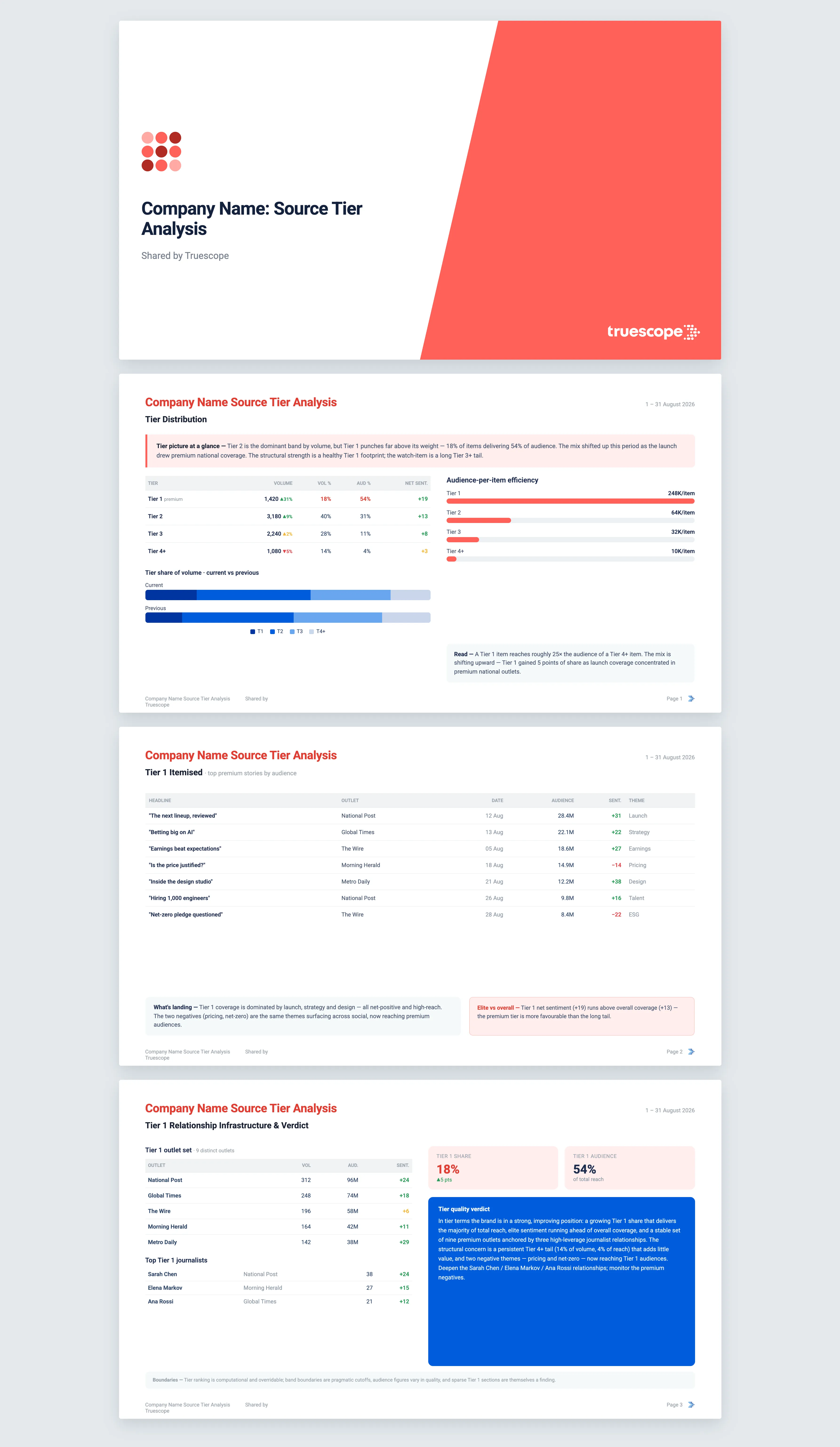
The report opens with a read of your tier picture, naming the dominant tier, the direction of movement, and the top tier's share of both volume and audience. A full distribution table sets out volume, change, audience, share, sentiment and intensity per tier against the equal prior period, with a stacked chart showing whether the mix is shifting up or down.
The heart of the report is the top-tier detail:
- An itemised list of your highest-authority articles by audience, each with headline, outlet, date, reach, sentiment and dominant theme.
- A top-tier sentiment and intensity table that flags when your elite coverage diverges from your overall picture, which is often the more important problem.
- The distinct top-tier outlets and the journalists writing your top-tier coverage, with concentration noted, since these are your highest-leverage relationships.
It then reads the rest of the hierarchy: mid-tier quality signals across verified, paywalled and political-leaning dimensions, the source-category composition of the long tail, a per-tier trajectory chart, and an audience-per-item efficiency comparison between the top and the tail. Every finding is cited back to the source coverage behind it. The report closes with an editorial verdict on where you stand, the direction you are heading, and the state of your top-tier relationship infrastructure.
Who it's for
This is for communications and PR leaders who are measured on the quality of coverage, not just the quantity, and who need to show executives or the board that the brand is landing where it counts. It serves teams building relationships with senior journalists at flagship outlets, and anyone who needs to know whether a healthy-looking total is propped up by low-authority noise.
Why Truescope Analyst
Working out your tier mix by hand means scoring every outlet for authority and re-scoring it every period, which is exactly the kind of task that quietly never gets done. Agency summaries rarely itemise the top-tier hits or expose when elite sentiment diverges from the headline number. A general AI tool cannot do it at all, because it has no authority ranking for outlets and only sees the single article you paste in, not your full spread of coverage.
Truescope Analyst applies a consistent authority ranking across your entire dataset, itemises top-tier coverage rather than burying it, surfaces sentiment divergence, and returns a cited, repeatable analysis in minutes. It is built into your subscription and available to everyone on the team, so the tier picture is on demand whenever you need to defend or explain coverage quality.
Frequently asked questions
What time range does the analysis cover?
You can analyse up to the last 13 months for coverage already in your Truescope inbox, or the last 90 days for global data not yet matched to your workspace. Each run compares your chosen window against the equal period immediately before it and charts each tier's movement across the window.
Can I benchmark my tier mix against a competitor?
Yes. Supply a competitor brand or workspace query and the report adds a tier benchmark showing whether you hold proportionally more or less top-tier share than they do. You can also narrow to a single country or region.
What happens if I have no top-tier coverage in the period?
The report says so plainly and continues. A period with no high-authority coverage is itself a finding, and the relevant sections will note the absence rather than be quietly skipped.