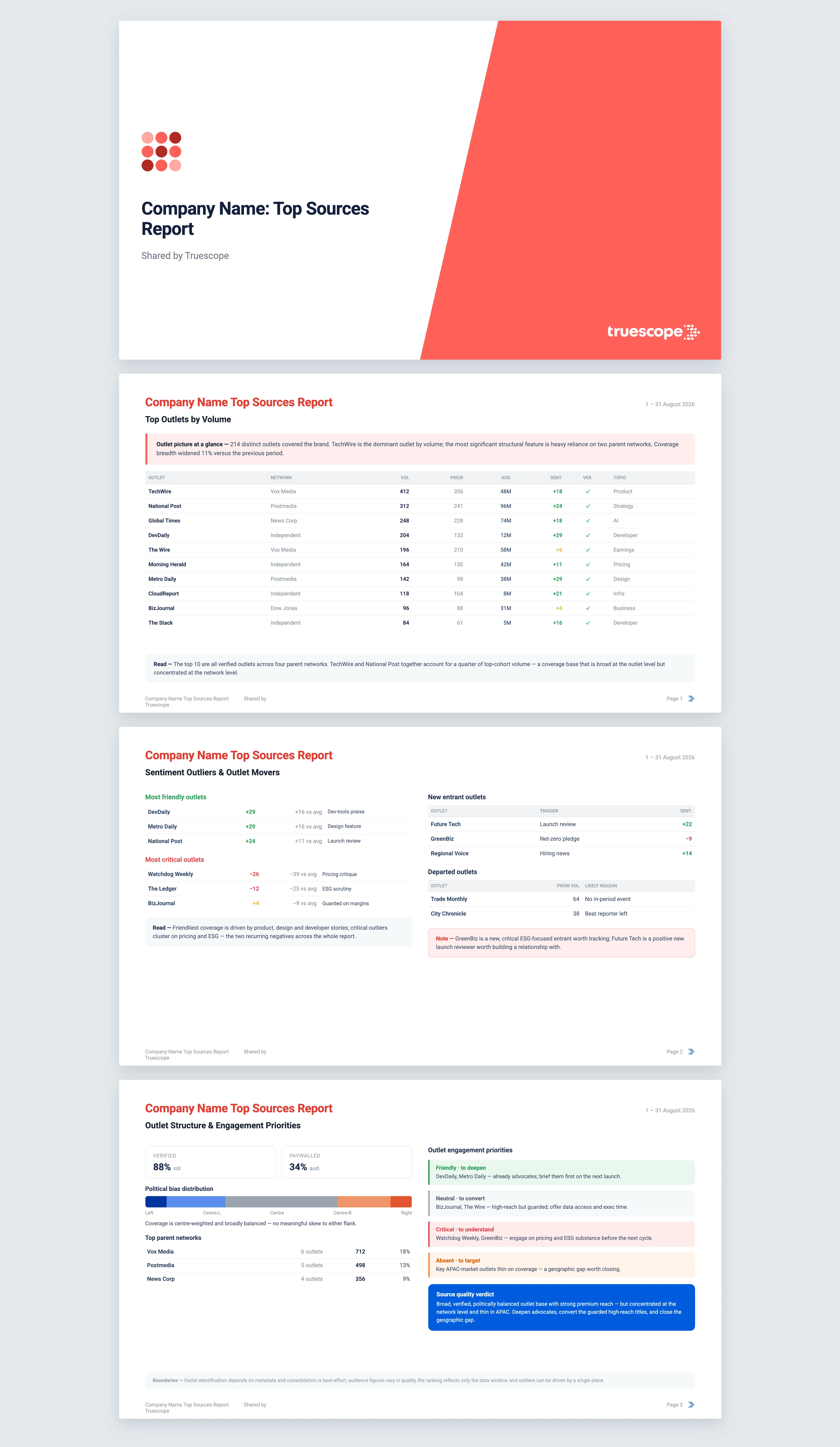
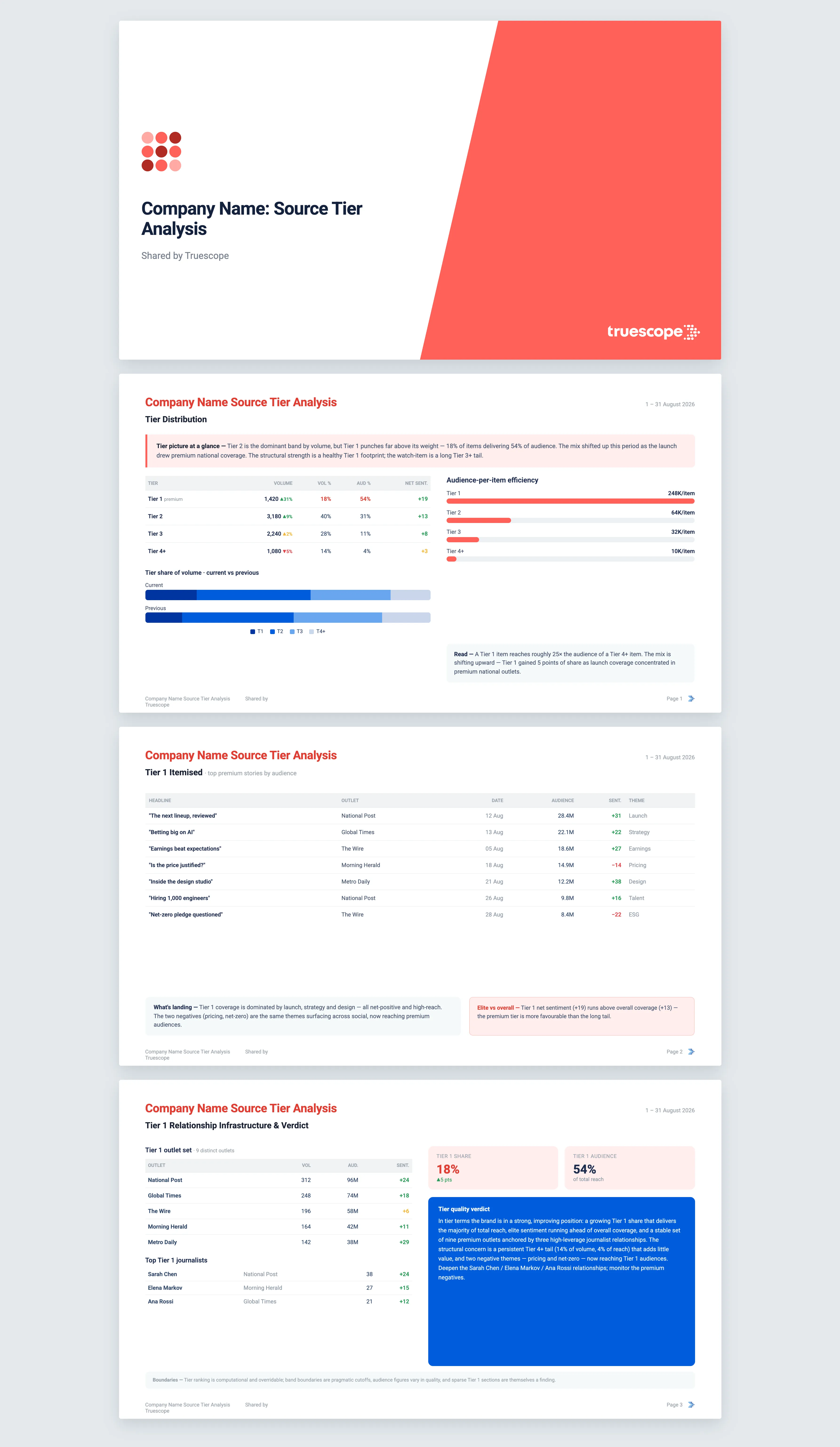
Source Bias Analysis
In politicised sectors and moments, it matters who is covering you and where they sit on the political spectrum. Source Bias Analysis maps your coverage across the political-leaning landscape of outlets, so you can see at a glance whether your story is reaching one side, both sides, or being pulled into a partisan frame. The picture is informational. What you do with it is your call.
What it does
This template answers a single strategic question: across the political spectrum of outlets covering your brand, how is coverage distributed, is that distribution balanced or skewed, and where does your brand sit in a politically-coloured media environment. It places every mention into a leaning band, from far left through centre to far right, plus an unrated band for outlets where political leaning does not apply. It then tests whether the spread is symmetric and whether your brand is being explicitly framed in political terms. The aim is to make an often invisible pattern explicit, not to tell you to change your position.
The questions it answers
- Is our coverage balanced across the spectrum, or skewed toward one side?
- Are we positive with the centre but negative with the left or the right, a classic sign of polarisation?
- Which outlets and journalists are driving coverage within each leaning band?
- Is anyone explicitly framing us in political terms, around donations, executive activity, or regulatory politics?
- Is the mix drifting toward the political extremes over the period, or settling toward the centre?
What's in the report
The report leads with a plain read of your bias picture and an overall pattern label, from balanced to centrist-skewed to polarised. A full distribution table follows, with volume, share, audience, net sentiment, intensity and engagement for every leaning band, each compared against the equal period immediately prior. A stacked bias mix chart shows the shift between periods.
It then makes the diagnosis concrete:
- Sentiment by band, surfacing the polarisation signature where the centre is warm but a flank is hostile.
- Intensity by band, identifying where the loudest coverage in either direction is coming from.
- Narrative themes, outlets and journalists within each band, so you can see exactly who is shaping the framing on each side.
- A skew analysis that names the direction and magnitude of any asymmetry and offers plausible drivers as reads, not assertions.
- A political controversy section enumerating any coverage that frames your brand in explicitly political terms.
- A bias mix trajectory chart over the period, showing whether you are being drawn into political narratives.
Every finding is cited back to the source coverage behind it. For multi-market brands, the analysis is run per country, because a "left" outlet in one country is not the same position as a "left" outlet in another. The report ends with an informational verdict on where you sit in the politically-coloured environment.
Who it's for
This is for communications, public affairs and corporate affairs teams operating in politicised categories, regulated industries, or election-adjacent moments. It serves leaders who need to brief executives, ministers or the board on reputational exposure across the political spectrum, and anyone managing a brand whose name keeps appearing next to political stories.
Why Truescope Analyst
Tracking where your coverage falls politically by hand means knowing the leaning of hundreds of outlets and re-counting every time, which almost no team has the bandwidth to sustain. Agency reports tend to give you a tone summary without the per-band breakdown, and a general AI tool cannot do it at all, since it has no map of outlet leanings and only sees the single article in front of it.
Truescope Analyst applies a consistent political-leaning classification across your whole dataset, tests the distribution for skew, separates the analysis by country where it must be, and returns a cited, repeatable read in minutes. It lives inside your subscription, so the same partisan picture is available to anyone on the team the moment the question comes up.
Frequently asked questions
What time range does this cover, and how is it compared?
You can analyse up to the last 13 months for coverage already in your Truescope inbox, or the last 90 days for global data not yet matched to your workspace. Each run compares your window against the equal period immediately before it, and can chart how the bias mix shifts across the window.
Why are some outlets shown as Unrated?
Political leaning does not meaningfully apply to many trade titles, government bulletins and corporate publications, so those sit in an unrated band for completeness. If unrated coverage dominates your volume, the verdict will note that the bias picture is only partially informative.
Does the template recommend a political position?
No. The analysis is strictly informational. It shows you where you stand and where any asymmetries are, and leaves every decision about positioning entirely to you.