Spokesperson Effectiveness
Find out who in your leadership actually lands in the media, not just who appears most. The Spokesperson Effectiveness template puts your named spokespeople side by side on consistent measures, normalises for the different opportunities each one gets, and tells you who to put forward in which context.
What it does
Volume is not effectiveness. A spokesperson quoted rarely but landing cleanly may serve you better than one quoted constantly to neutral effect. This template runs a fair comparison across a cohort of three to six named spokespeople, measuring how well each lands messages, the sentiment they carry, the reach and source quality they attract, and how consistent they are over time. The discipline is to compare like with like, adjust for the fact that different people get different amounts of airtime, and refuse to mistake frequency for impact. The output is a comparative read, an effectiveness tournament rather than a row of separate portraits.
The questions it answers
- Across our cohort, who is the most effective spokesperson in the media overall?
- Who punches above their weight, ranking higher on effectiveness than their share of coverage would suggest, and who punches below it?
- Which of our key messages are landing, and through which spokesperson?
- Who is strongest in which context, broadcast versus print, one region versus another, one topic versus another?
- Where are the gaps and redundancies in our spokesperson portfolio?
What's in the report
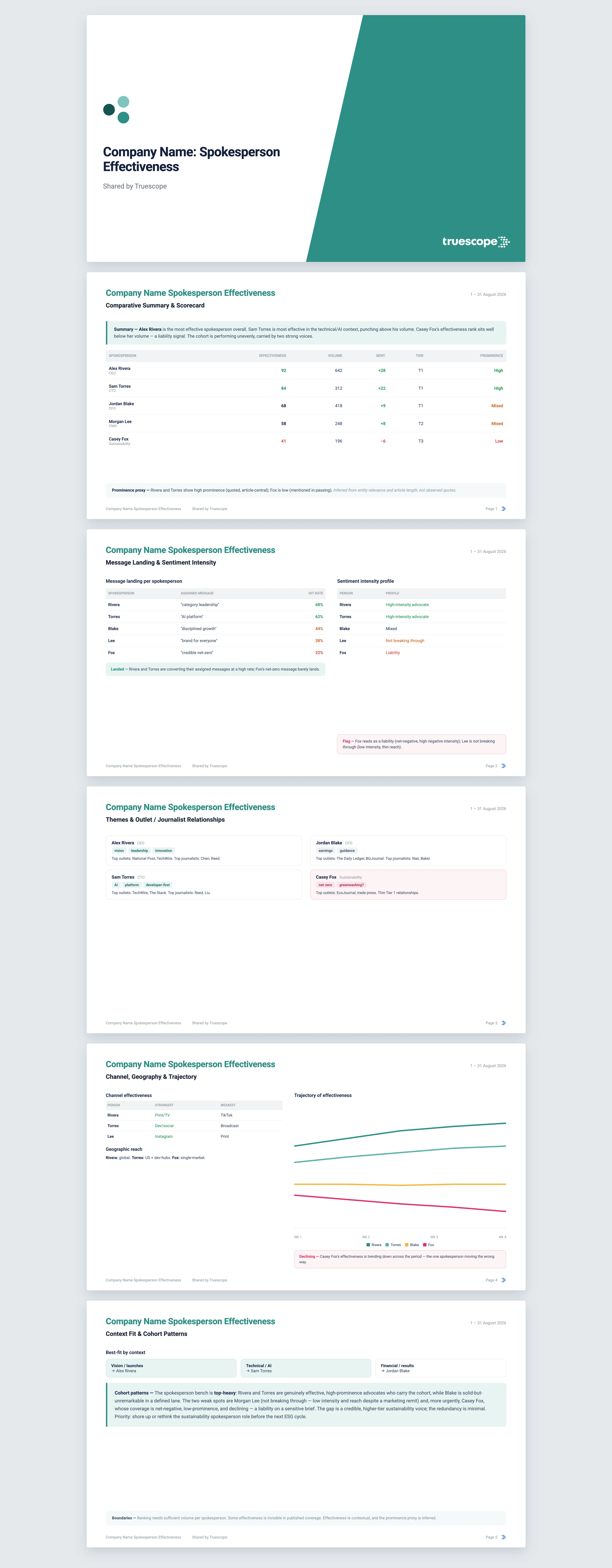
The report opens with a comparative summary and a per-spokesperson effectiveness scorecard ranked by a stated composite formula, with anyone whose effectiveness rank diverges sharply from their volume rank flagged. Every figure is cited back to the coverage behind it.
- A scorecard covering mention volume, sentiment, intensity, audience, average outlet tier, social engagement, distinct journalists, and both composite and volume rank.
- A quote prominence proxy classifying how prominently each spokesperson actually features, from high to low.
- Message landing per spokesperson, where you supply the messages assigned to each person, showing what is landing and what is not.
- Sentiment intensity profiles, marking high-intensity advocates, liabilities, and voices that are simply not breaking through.
- Themes, outlet and journalist relationships, channel effectiveness, and geographic reach for each spokesperson.
- A trajectory chart of effectiveness over time, a context-fit view where you supply a context dimension, and a cohort-level read on the portfolio as a whole.
Who it's for
This is for heads of communications, executive comms advisers, and PR teams who manage a bench of spokespeople and need to deploy them deliberately. It suits decisions about who fronts an investor announcement versus a consumer launch, who handles regulatory press, and which executive to coach, rest, or put forward more often.
Why Truescope Analyst
The usual way to judge a spokesperson is gut feel, a clippings folder, and the loudest opinion in the room. Comparing several people fairly is harder still, because each gets a different volume of opportunity and a simple count rewards whoever is quoted most rather than whoever lands best. A general-purpose AI tool cannot run the comparison either: it sees only the articles you paste in, cannot normalise across the cohort, and has no way to measure sentiment toward a named individual within a piece rather than the article overall.
Truescope Analyst compares the whole cohort across your full dataset on one consistent formula, reads sentiment toward each named person rather than the document, adjusts for differing opportunity, and cites every result back to source. It produces the comparison in minutes, applies the same method every time, and is built into your subscription, so the effectiveness picture is something the comms team can revisit before each major moment.
Frequently asked questions
How many spokespeople can I compare, and over what period?
The cohort works best at three to six named individuals; fewer makes the comparison trivial and more makes it unreadable, so larger cohorts are split or capped. It reads up to the last 13 months of coverage in your Truescope inbox, or the last 90 days for global data not yet matched to your workspace, and a longer window helps because per-spokesperson volume can be sparse.
Can it show who lands which messages, and who suits which context?
Yes. Supply the messages assigned to each spokesperson and the report measures how often each message and person appear together. Supply a context dimension, such as media type, region, or topic, and effectiveness is broken down across it, so you can see who is strongest where.
What if one spokesperson barely appears in coverage?
Anyone with very low volume cannot be ranked reliably, so their row is flagged as tentative and held out of the main effectiveness ordering rather than being scored as if the data supported it. The report is explicit about where the numbers are too thin to trust.