This template is one of 70+ report templates that is available in Truescope Analyst, your AI media analyst teammate. Book a demo to use this template or to create your own reusable template.
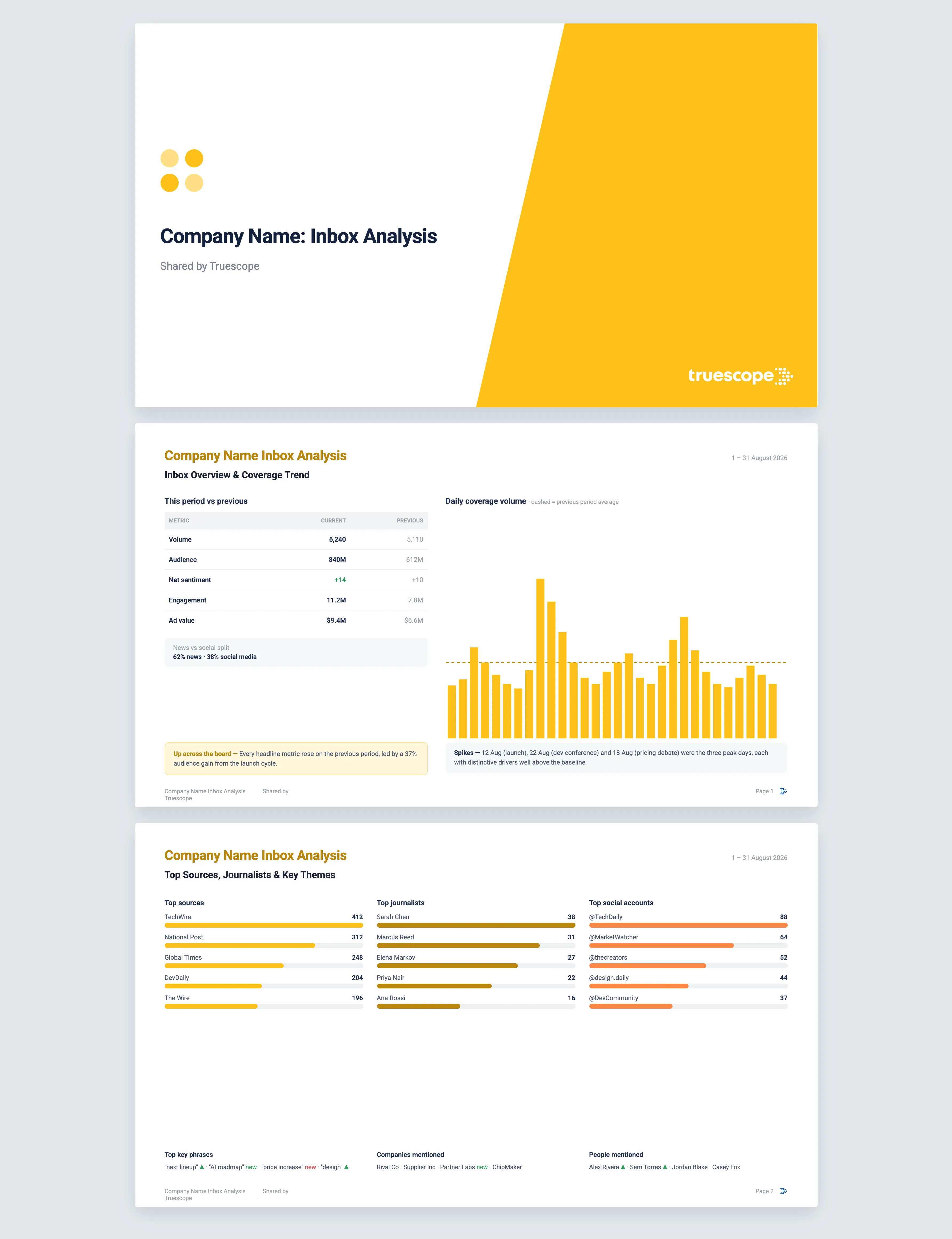
The foundational template. Inbox Analysis is a comprehensive read of your entire media inbox over any period you choose, covering volume, sentiment, sources, themes and the stories behind every spike.
What it does
Inbox Analysis is the all-purpose deep dive that other reports build on. You pick a period, the last 24 hours, 7 days, 30 days or a custom range, and it analyses your whole inbox against the matching period immediately before. It is comprehensive by design: headline metrics, a per-topic breakdown, the daily trend, the sentiment picture, the people and outlets driving coverage, and the specific stories that explain why volume rose on the days it did. When you want the complete picture rather than a particular cut, this is the template to run.
The questions it answers
- How did our coverage move against the previous period across volume, audience, sentiment, engagement and ad value?
- Which of our topics carried the coverage, and which moved most?
- Which days spiked, and exactly what stories drove them?
- How is sentiment splitting across positive, negative, neutral and mixed over time?
- Who are the top sources, journalists and social accounts covering us?
- Which phrases, companies and people are most mentioned, and what is new this period?
What's in the report
The analysis opens with an inbox overview table comparing the current and previous periods across volume, audience, net sentiment, engagement and ad value, with the news-versus-social split benchmarked beneath it.
It then works methodically through your coverage:
- A coverage trend chart with the previous period's daily average drawn in, and a spike analysis that names the stories and distinctive phrases behind each of the top days.
- Coverage by query, a performance chart plotting each topic by audience, engagement and volume, plus a per-topic table with significant movers flagged.
- A media type comparison showing how the channel mix shifted against the previous period.
- A sentiment trend chart breaking each interval into positive, negative, neutral and mixed with the net line overlaid.
- Top sources, journalists and social accounts, each as a ranked chart, with journalist and account lists cleaned of generic bylines and noise.
- Key themes and entities, three ranked tables covering phrases, companies and people, each compared against the previous period and marked where something is new.
The reporting interval adapts to the period you choose, moving from hourly for short ranges to weekly or monthly for longer ones, so the trend always reads clearly. Every spike narrative is built from the actual items behind it and traces back to source coverage.
Who it's for
Inbox Analysis suits anyone who needs the full picture rather than a single angle. It works for a comms or PR team running their standard period review, an analyst investigating an unusual stretch of coverage, and a team that wants one thorough report they can read end to end before deciding what to look at more closely.
How to use this template
This template runs inside Truescope Analyst, the AI media analyst in the Truescope platform. Point it at your own coverage, set the window, and Analyst returns the full report with every claim cited to source. You can also save your own analysis as a reusable template and run it on a schedule. Book a demo and we will run this one on your coverage.
Why Truescope Analyst
Producing this by hand is the job that eats a comms analyst's week: exporting the period, building every chart, cleaning the journalist lists of staff bylines and wire-service labels, then chasing down the stories behind each spike day one by one. It is thorough work, which is exactly why it so often gets shortened or skipped under deadline. A general AI tool cannot do it at all, because it has none of your inbox, cannot compare two periods it cannot see, and cannot point to a single real source.
Analyst runs the whole sequence in order across your entire inbox: it compares the two periods, builds the trend and sentiment views, ranks the sources, journalists and accounts with the noise filtered out, and isolates the phrases distinctive to each spike day before retrieving the items that explain them. The interval adjusts to your chosen range automatically. Every figure and story is cited back to source coverage, the report is produced in minutes rather than days, and because it sits inside your Truescope subscription, anyone on the team can run it.
Frequently asked questions
What periods can I analyse?
You can choose the last 24 hours, 7 days, 30 days or a custom range, and Analyst automatically compares it against the same number of days immediately before. It can read up to the last 13 months of coverage in your Truescope inbox, or the last 90 days of global data not already matched to your workspace, so your chosen period sits comfortably inside what is available.
How does it work out what caused a spike?
It finds the highest-volume days in the trend, identifies the phrases distinctive to those days rather than your everyday baseline themes, then pulls the actual items behind them so the spike narrative references real headlines, not a generic summary.
Why are some journalists or accounts left out of the rankings?
The journalist and social account lists are cleaned before they are shown, removing URLs, generic bylines such as staff reporter or newsdesk, wire-service labels and entries that are clearly not real names, so the rankings reflect the people and accounts that genuinely matter.
See how you can get more signals and insights from your media intelligence platform
See how you can get more signals and insights from your media intelligence platform


.svg)